Color Grading: Why It Makes All The Difference To Your Videos And 4 Tips To Make It Easy
So you’ve worked on your video production concept, done some great filmmaking, and cut it with some snappy editing. That’s great! However, you look at your video, and the visuals aren’t right.
Has this ever happened to you? There’s a simple reason why your supposedly professional video pales in comparison to your competitors’: color grading. The amount of companies that skip this vital step of video post production is shocking. The sad thing is that it’s completely avoidable.
We know the feeling. You’ve got a working cut of your corporate video put together, and you haven’t engaged with your audience for a while. Why not just put out the video now? But the thing is that the look of your video production says everything about what your brand is. Trust us, tweaking that video’s color grade will make all the difference.
You needn’t be Leonardo Da Vinci either to get color grading right, when you know a few easy tips. Here is the best production company color grading advice for you:
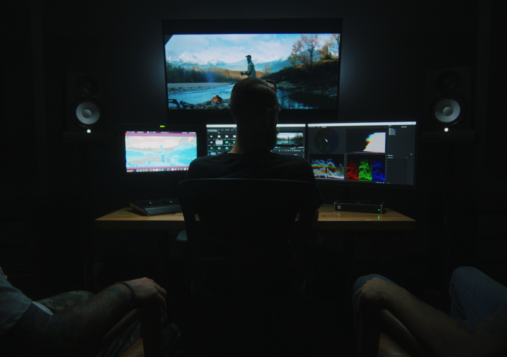
Test Out A Few Different Things Before You Start
Are you not sure which colors in the grade will give you the right look? That’s fine. Ideally, you should have a mood board or other branding materials to draw from. But if you’re still confused, then there’s no need to despair. There’s a simple and efficient way to select your color grade’s tone.
First, you need to decide which image really summarizes your video overall. Once you’ve got that, export a frame from the shot and play around in Photoshop or another imaging software.
The advantage of this is obvious. Now you can spend a bit of time creating say four different color grade templates for the same image. This will stop you from having to apply four different grades and their different hues and saturations to every shot in your edit each time.
It may seem counterproductive to spend so long on one image initially, but in actuality, it’s a time saver. You can lock in a color grade for that image and then apply it to each shot, tweaking throughout.
Be Consistent
If you’re making a video production in a range of locations, you’re bound to get an range of different colors in the visuals. Sometimes this can happen even in a studio set up. Just moving the camera will inevitably create different levels of light. Also, matching up saturation, contrast and shutter speed on a camera between shots is difficult even for the pros!
The answer to your filmmaking woes here is consistency in color grading. Your brand is going to have its own color palette. Therefore, you’re going to want to get those colors into the grade. So begin by working from the colors that you know you want in every shot, and tweak throughout, making everything consistent. When applied properly, you’ll be shocked at just how much more professional your video production looks!
Stay Simple!
Look at your editing software’s color grading options. You’ll probably see that there’s a ton of different features. And while each one has its own function, most are for large scale productions only. The creators of the software really developed them for filmmaking on a cinematic level. However, a corporate video is different to a big screen movie. Most people will only ever view it online, and many of them will not even watch the video in full screen.
Therefore, every last corner of every last shot of your corporate video production shouldn’t be the focus. It’s the overall visual. One of the simpler tools can be preferable in this instance. RGB Curves, for example, is a fantastic tool. If you open it, you’ll see four boxes with a diagonal line in the middle. The diagonal lines change the color. The top left box controls the overall image, the other three control the red, green and blue in your image. You’ll see the changes instantly. Once you’ve played around with something you’re generally happy with, you can nest the effect onto all shots. From this point onwards, you have a basic color grade. You’ll still have to adjust the RGB curves of each shot in the edit, but you’ll probably find that that’s all you need to get something looking great!
Get A Second Pair Of Eyes To Approve
It’s a funny thing, editing. Flagship’s staff has been working with editors for decades, and seasoned editors at that. And no matter how much experience, there’s bound to be at least one blunder in a first edit’s color grade.
A misgraded a shot is the exact same thing as a grammar error in an article. They crop up in every writer’s work, no matter how experienced. It’s because the original creator of either the article or the color grade gets to a point where they can’t objectively analyze the product. Overall, they may have edited a video production that looks good, but a few rogue grades can really spoil the whole thing.
Avoiding this mistake is literally as easy as getting someone you trust to take a look at the almost final color grade. If they’ve got a good eye, they should be able to pick out anything that looks weird, that interferes with the mood or which detracts from the brand.
This is really just scratching the surface of color grading. However, the information contained above should really give you be basics of everything you need to start color grading like a pro. You’ll learn throughout the editing process how to color grade better and better. We’re sure that soon you’ll be color grading like a professional movie production company!